🧮 Grid layout & styles
Time to add content to our sticky element.
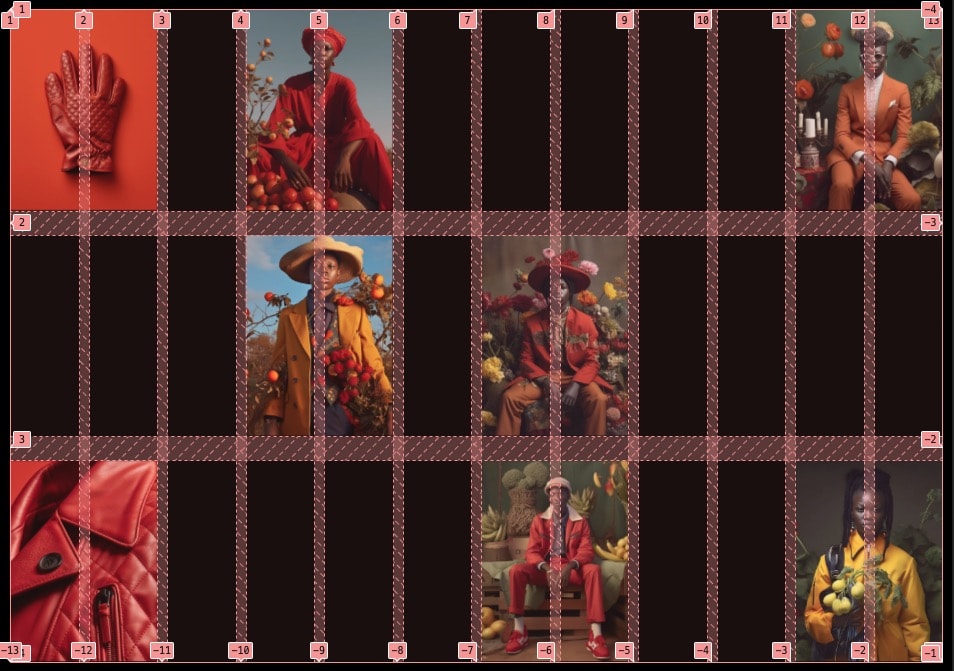
Showing up the grid in the design reveals that this is a perfect candidate for a display: grid; setup. Let's add the markup & styles
Markup
<figure class="c-fancy-gallery">
    <div class="c-fancy-gallery_sticky-area">{# This will define the "stickiness" boundaries #}
        <div class="c-fancy-gallery_sticky">{# This is the element that will stick #}
            <div class="c-fancy-gallery_grid">
                {% for image in gallery.images %}
                    <div class="c-fancy-gallery_grid-item">
                        {% include "@snippets/image.twig" with {
                            src: image.src,
                            width: image.width,
                            height: image.height
                        } only %}
                    </div>
                {% endfor %}
            </div>
        </div>
    </div>

    <div class="c-fancy-gallery_spacer">{# This allows to occupy vertical space that'll define the scroll length of our animation #}</div>

    <figcaption class="c-fancy-gallery_caption">
        {# Split the sentence by words #}
        {% for word in gallery.caption | split(' ') %}
            <span class="c-fancy-gallery_word">
                <span class="c-fancy-gallery_word-inner">{{word}}</span>
            </span>
        {% endfor %}
    </figcaption>
</figure>
Styles
We need to setup the grid container first. The idea here is to center the grid on the screen but alos let the images ratio dictate its height. We will only restrict each image width to match with the grid. With that, we can encounter 3 scenarios:
- The grid height is larger than the viewport. As we center the element with the
top/leftat 50% with a negativetransformto compensate, it will only crop vertically (which we want). - The grid height is smaller than the viewport. In that case, the
min-height: 100%&align-items: centercombo kicks in - The grid height is the exact same size than the viewport: it's the perfect scenario!
.c-fancy-gallery_grid {
    position: absolute;
    min-height: 100%; // Allow height to be higher than 100% to preserve images aspect-ratio, ok as long as the container is center
    top: 50%;
    left: 50%;
    transform: translate(-50%,-50%);
    align-items: center;
    gap: 2.5vw var(--grid-gutter);
    overflow: hidden;

    // Grid on desktop-ish
    @media (min-width: $from-small) {
        display: grid;
        width: 100%;
        grid-template-columns: repeat(12, 1fr);
        grid-template-rows: repeat(3, 1fr);
        padding: var(--container-margin); // Could've used `-container` include but we also need vertical padding so easier this way
    }

    // Flex on mobile-ish
    @media (max-width: $to-small) {
        display: flex;
    }
}
We only want to display 3 pictures on mobile devices, and there won't be a crazy animation so a simple flex is enough
Buckle up for our grid items, it's a long vertical one! But it's easy to read and the grid system gives us the most control.
.c-fancy-gallery_grid-item {
    position: relative;
    background-color: var(--color-bg);

    // Desktop-ish
    @media (min-width: $from-small) {
        &:first-child {
            grid-column: 7 / 9;
            grid-row: 2 / 3;
            z-index: 10;
        }

        // First row
        // ==========================================================================
        &:nth-child(2) {
            grid-column: 1 / 3;
            grid-row: 1 / 2;
        }

        &:nth-child(3) {
            grid-column: 4 / 6;
            grid-row: 1 / 2;
        }

        &:nth-child(4) {
            grid-column: -3 / -1;
            grid-row: 1 / 2;
        }

        // Second row
        // ==========================================================================
        &:nth-child(5) {
            grid-column: 4 / 6;
            grid-row: 2 / 3;
        }

        // Third row
        // ==========================================================================
        &:nth-child(6) {
            grid-column: 1 / 3;
            grid-row: 3 / 4;
        }

        &:nth-child(7) {
            grid-column: 7 / 9;
            grid-row: 3 / 4;
        }

        &:nth-child(8) {
            grid-column: -3 / -1;
            grid-row: 3 / 4;
        }
    }

    // Mobile-ish
    @media (max-width: $to-small) {
        width: 50vw;
        display: none;

        // Only display first 3 items
        @for $i from 1 through 3 {
            &:nth-child(#{$i}) {
                display: block;
            }
        }

        // Customize order
        &:nth-child(1) {
            order: 2;
        }
        &:nth-child(2) {
            order: 1;
        }
        &:nth-child(3) {
            order: 3;
        }
    }
}
Instead of defining the ending column on each grid item, we could use span 2 as all of them have a width of 2 columns. So for example on the first-child on desktop-ish:
grid-column: 7 / span 2;
Notice that the first item on desktop is setup to display above the others, it's important for our animation