✍️ Editorial component & snippet
You may have noticed we skipped a small section right after the hero until now.
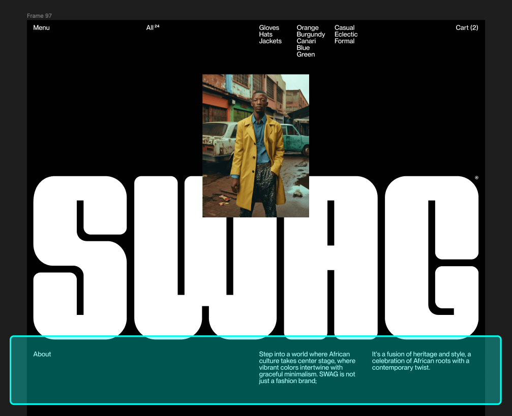
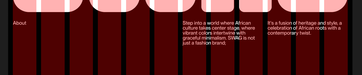
Look closer
We can identify two parts here:
- A header with a title
- A content block, including 2 paragraphs in this instance.
The thing is... if we look further in the page, there are two similar blocks!

We can identify some variations though:
- The header can contain more than just a title
- The content can be simple with standard paragraphs, but also rich with multiple accordions
- Spacing is not the same on the 3 blocks.
Variations handling
Content variations can easily be tackled using embed + blocks combination. Styles variations such as different spacings & paddings can be handled with specific modifiers such as -about, -faq, -manifesto (I named that last one arbitrarily 👀).
Knowing that, we only need to handle the two main parts (head & content) of our layout inside the snippet.
Analyzing the snippet
In this snippet, we are see that it contains two {% block %} tags. These {% block %} tags will later be utilized to inject code from a parent file using the embed feature.
This file is already added in the chapter's snapshot!
{% set _classes = classes | default(null) %}
{% set _modifiers = modifiers | default(null) %}
{% set _attr = attr | default(null) %}

{% if _classes != null %}
    {% set _classes = ' ' ~ _classes %}
{% endif %}

{% if _modifiers != null %}
    {% set _classes = ' ' ~ _modifiers ~ ' ' ~ _classes %}
{% endif %}

<section class="c-editorial {{ _classes }}" {{ _attr }}>
    <div class="c-editorial_head">
        {% block head %}{% endblock %}
    </div>
    <div class="c-editorial_content">
        {% block content %}{% endblock %}
    </div>
</section>
The snippet is paired with these styles.
This file is already added in the chapter's snapshot!
.c-editorial {
    @include -container; // Container mixin handles lateral margins
    display: flex;
    justify-content: space-between;
    gap: var(--grid-gutter); // Use the global grid gutters

    // Go vertical on mobile-ish devices
    @media (max-width: $to-medium) {
        flex-direction: column;
    }
}

.c-editorial_head {
    width: grid-space(math.div(6,12)); // 6 columns wide
}

.c-editorial_content {
    flex: 1; // Auto fill the rest of the width available
}
Snippet usage
In this example, we show how to inject various pieces of code into the defined {% block %} tags, including the inclusion of other files.
{% embed "@snippets/editorial.twig" with {
    modifiers: '-about',
    classes: 'u-margin-large-bottom',
    data: about
} only %}
    {% block head %}
        <h2>{{data.title}}</h2>
    {% endblock %}
    {% block content %}
        {{ data.content }}
    {% endblock %}
{% endembed %}
Other examples, including one with an {% include %} tag within the {% block content %} :
{% embed "@snippets/editorial.twig" with {
    modifiers: '-faq',
    classes: 'u-margin-huge-bottom',
    data: faq
} only %}
    {% block head %}
        <h2>{{data.title}}</h2>
        <p>{{data.description}}</p>
    {% endblock %}
    {% block content %}
        {% for item in data.items %}
            {% include "@snippets/accordion.twig" with {
                title: item.title,
                content: item.content
            } only %}
        {% endfor %}
    {% endblock %}
{% endembed %}

{% embed "@snippets/editorial.twig" with {
    modifiers: '-manifesto',
    classes: 'u-margin-huge-bottom',
    data: manifesto
} only %}
    {% block head %}
        <h2>{{data.title}}</h2>
    {% endblock %}
    {% block content %}
        <p>{{data.description}}</p>
    {% endblock %}
{% endembed %}
Adding the modifiers
Our template (index.twig) already contains all the markup variations of the editorial snippet. But we're still missing on some styles specifics such as the columns aspect for our content in the About section. Worry not, as -about modifier will allow us to fix that in a blink!
// ...
.c-editorial_content {
    flex: 1;

    .c-editorial.-about & {
        @media (min-width: $from-medium) {
            columns: 2;
            column-gap: var(--grid-gutter);
        }

        @media (max-width: $to-medium) {
            p {
                display: inline;
            }
        }
    }
}
// ...
Perfect! We're done for the About section. Let's look at the FAQ and Manifesto specifics now.
- The FAQ head has a 3 columns padding on the right
- The Manifesto head has a 4 columns padding on the right
- The Manifesto content has a 2 columns padding on the right
Dang.. that's a lot of paddings on the right, right? 🫢 Let's add those rules along with some RWD specifics.
//...
.c-editorial_head {
    width: grid-space(math.div(6,12));

    .c-editorial.-faq & {
        // Add padding right only on desktop-ish devices
        @media (min-width: $from-medium) {
            padding-right: grid-space(math.div(3,12), 1);
        }

        // Make it full width on small devices
        @media (max-width: $to-small) {
            width: 100%;
        }
    }

    .c-editorial.-manifesto & {
        // Add padding right only on desktop-ish devices
        @media (min-width: $from-small) {
            padding-right: grid-space(math.div(4,12), 1);
        }
    }
}

.c-editorial_content {
    flex: 1;

    .c-editorial.-about & {
        @media (min-width: $from-medium) {
            columns: 2;
            column-gap: var(--grid-gutter);
        }

        @media (max-width: $to-medium) {
            p {
                display: inline;
            }
        }
    }

    .c-editorial.-manifesto & {
        @media (min-width: $from-small) {
            padding-right: grid-space(math.div(2,12), 1);
        }
    }
}