🪗 Accordions 101
Accordions the old way
There are many ways to create accordions on the web! You've probably all done some plenty of times in multiple ways. The most common being to handle it with a button and some javascript:
<article class="c-accordion">
    <button
        class="c-accordion_toggler"
        aria-expanded="false"
        aria-controls="my-accordion-content">
        My accordion title
    </button>
    <div class="c-accordion_content" id="my-accordion-content">
        Lorem ipsum dolor sit amet consectetur adipisicing elit.
        Optio molestiae fugiat architecto ipsum nulla inventore est libero expedita,
        earum sit impedit pariatur ex explicabo ipsam, totam consequatur, numquam minima aliquam.
    </div>
</article>
That solution works, however you have to handle many things to make it work & remain accessible. Amongst other things, you need to
- Handle the show/hide of the content manually
- Update ARIA attributes accordingly to the current state
- Have a unique ID attribute on your content wrapper (one more thing to deal with on long faq pages)
What if I told you there's an easier way? 👀
Introducing details & summary
Those two elements - you may or not have heard of - will save us some time! As native HTML elements, they already include all the semantics & properties required to convey the browser that we're in an Accordion-like situation. Meaning screenreaders will interpret it correctly without you having to struggle with all those aria attributes and unique IDs!
Also, it automatically appends a open attribute on the details element when the accordion is opened: amazing! All of that means we don't have to add any Javascript at all, just CSS and we're good to go!
In some instances like more complicated accordions layout than ours today: you may still need to use some Javascript. It's alright though! Javascript is not a bad word when it comes to accordions: it can be of great help!
Our point simply is that sometimes native HTML features can save you some time and be plenty enough 😉
Analyzing our solution
The snippet
This file is already added in the chapter's snapshot!
Utilizing the details and summary tag within our snippet.
{% set _title = title | default(null) %}
{% set _content = content | default(null) %}
{% set _classes = classes | default(null) %}
{% set _modifiers = modifiers | default(null) %}
{% set _attr = attr | default(null) %}

{% if _classes != null %}
    {% set _classes = ' ' ~ _classes %}
{% endif %}

{% if _modifiers != null %}
    {% set _classes = ' ' ~ _modifiers ~ ' ' ~ _classes %}
{% endif %}

<details class="c-accordion {{ _classes }}" {{ _attr }}>
    <summary class="c-accordion_summary">{{ _title }}</summary>
    <div class="c-accordion_content">
        <div class="c-wysiwyg">{# Useful component for rich content #}
            {{ _content }}
        </div>
    </div>
</details>
The styles
This file is already added in the chapter's snapshot!
Simple styles for our accordion.
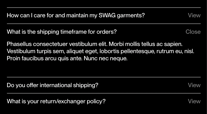
The open attribute helps apply different styles to an element to make it look distinct when it's open compared to when it's closed.
.c-accordion {
    border-top: 1px solid;
}

.c-accordion_summary {
    position: relative;
    padding: .75em 0;
    list-style: none; // Get rid of browser's default styles
    user-select: none; // Debatable

    // Use a pseudo-element to handle the label from the design
    &:before {
        content: 'View';
        float: right;
        opacity: .5;
        margin-left: 1em;
    }

    // Here's where the `open` attribute gets useful
    .c-accordion[open] & {
        &:before {
            content: 'Close'
        }
    }

    .c-accordion:hover &{
        &:before {
            opacity: 1;
        }
    }
}

.c-accordion_content {
    display: none;
    padding-top: .1em;
    padding-bottom: 2.5em;
    animation: none;

    .c-accordion[open] & {
        display: block;
        // Add an animation to make the reveal fancier ✨
        animation: slideInUp $speed $easing both;
    }
}