Adding the products listing
Alright, now let's attack the main part of this chapter : The products listing.
The markup
Locate the partial file products.twig and add the starting markup.
/views/partials/products.twig
<section class="c-products || u-margin-large-bottom">
    <h2 class="u-screen-reader-text">{{products.title}}</h2>
</section>
Next, add these elements inside our partial.
/views/partials/products.twig
<section class="c-products || u-margin-large-bottom">
<h2 class="u-screen-reader-text">{{products.title}}</h2>
<div class="c-container">
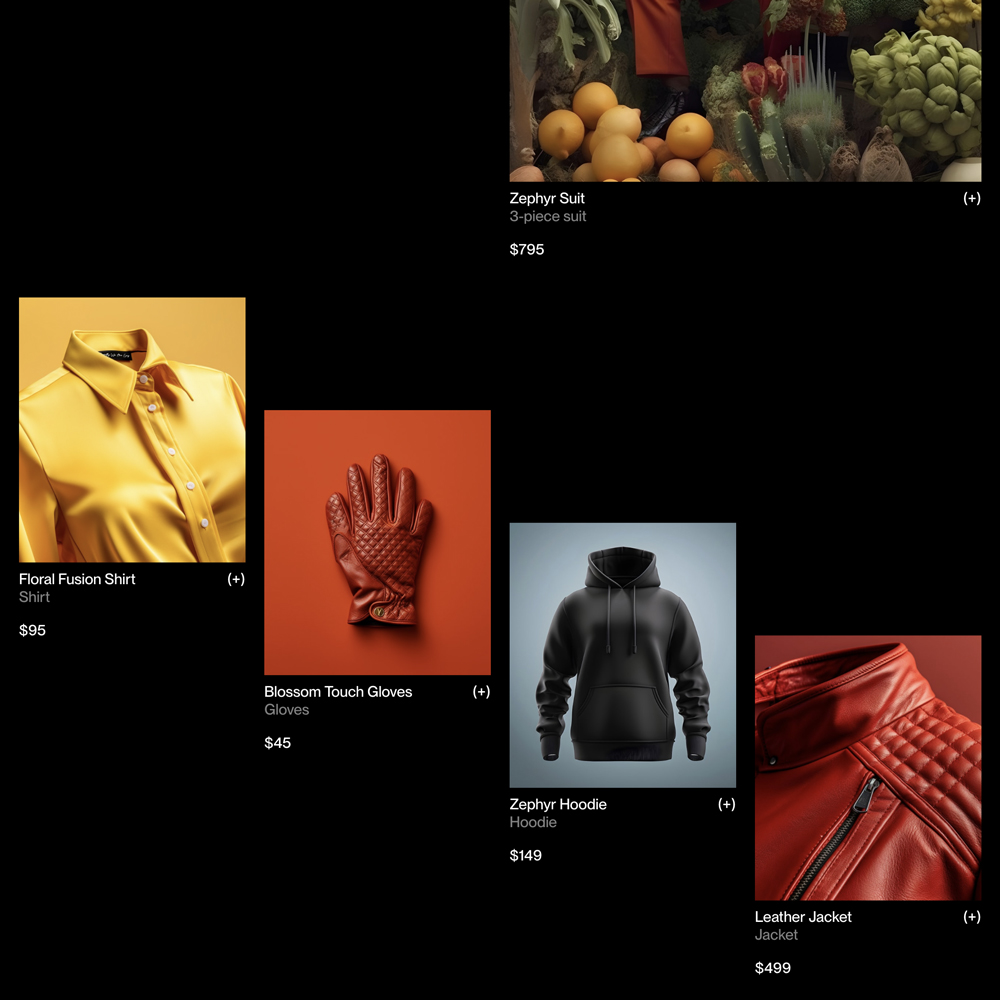
<div class="c-products_highlight">
{% include "@snippets/product-tile.twig" with {
product: products.items[0]
} only %}
</div>
</div>
<div class="c-products_list">
{% for index, product in products.items %}
{% if index >= 1 %}
{% include '@snippets/product-tile.twig' with {
classes: 'c-products_item u-margin-medium-bottom',
product: product
} only %}
{% endif %}
{% endfor %}
</div>
</section>
The styles
Add these basic styles to the products component, then we'll be ready for the next step.
/assets/styles/components/_products.scss
.c-products_highlight {
    @include -margin-huge-bottom;
    margin-right: 0;
    margin-left: auto;

    @media (min-width: $from-small) {
        width: grid-space(math.div(1,2));
    }
}

.c-products_list {
    @include -container;
    display: grid;
    gap: var(--grid-gutter);

    @media (min-width: $from-medium) {
        grid-template-columns: repeat(4, 1fr);
    }

    @media (min-width: $from-small) and (max-width: $to-medium) {
        grid-template-columns: repeat(3, 1fr);
    }

    @media (min-width: $from-tiny) and (max-width: $to-small) {
        grid-template-columns: repeat(2, 1fr);
    }
}
All the preparation is done. We can now tackle the Cascade Effect 🌊