🌊 Cascade Effect
Now that we've completed the layout and styles, we have an exciting challenge for you. We are gonna be recreating the "Cascade Effect" animation using Locomotive Scroll and CSS progress.
In order to better understand this step, it's useful to add some debugging backgrounds:
.c-products {
    background: linear-gradient(
        to bottom,
        /* First row color and height */ transparent 1px,
        /* Gap between rows */ transparent 10px,
        /* Height of the second row */ rgba(white, 0.1) 10px /* Second row color */
    );
    background-size: 100% 20px; /* Adjust the height based on your row height */
    background-repeat: repeat-y; /* Repeat vertically */
}

.c-products_list {
    background-color: rgba(cyan, 0.2); // Temporarily, for debug
}

Initializing the scroll progress
With some Locomotive Scroll attributes we can specify the element that we want to observe it and apply a CSS --progress variable.
Spot the .c-products_list element and start by adding the attributes :
<section class="c-products || u-margin-large-bottom">
    {# ... #}

    <div
        class="c-products_list"
        data-scroll
        data-scroll-css-progress
        data-scroll-offset="-33%,66%"
    >
        {% for index, product in products.items %}
            {% if index >= 1 %}
                {% include '@snippets/product-tile.twig' with {
                    classes: 'c-products_item u-margin-medium-bottom',
                    product: product
                } only %}
            {% endif %}
        {% endfor %}
    </div>
</section>
Specifies the trigger offset of the element within the viewport. It takes two values:
- the first one is the offset for the bottom of the screen detection (when the element enters as you scroll down),
- the second one is the offset for the top of the screen (when the element leaves as you scroll down).
In our case:
-33%, 66% means that LS will start incrementing the progress from 0 when the top of the element is 1/3 of the viewport's height below the bottom of our screen, and will stop at 1 when the bottom of the element is reaching 2/3 of the viewport height below the top of the screen.
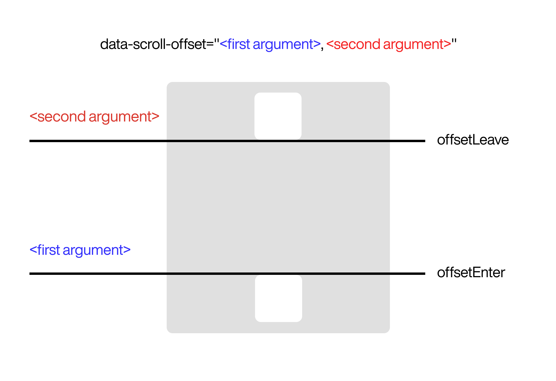
In our case :

We're using a negative value for the first offset to start our animation sooner because our animation will use y transforms and the c-products_item elements will overflow above the c-products_list. Don't worry, it'll make more sense with the animations working 😉
Applying styles based on the progress value
Basics
In this section, we will need to apply styles to the .c-products_item. We will leverage the power of SCSS loops. For now, we will only focus on the desktop version. We will add the responsive styles later.
First, let's start by adding the SCSS loop for our 4 product tiles.
// ...
.c-products_item {
    @for $i from 1 through 4 {
        // This part calculates the positions of the child elements you want to select.
        &:nth-child(#{$i}) {

        }
    }
}
Then we can start playing arround with the progress value inside a transformY() property.
.c-products_item {
    @for $i from 1 through 4 {
        &:nth-child(#{$i}) {
            transform: translateY(calc(-100% * var(--progress))) translateZ(0);
        }
    }
}
You should see the tiles moving, but not the way we want... Now, let's incorporate our SCSS index (#{$i}) into our transform and add some calculations to make it look good:
.c-products_item {
    @for $i from 1 through 4 {
        &:nth-child(#{$i}) {
            transform:
                translateY(
                    calc(
                        33%
                        * #{$i - 2.5}
                        * (1 - var(--progress))
                    )
                )
                translateZ(0);
        }
    }
}
- 33% is our base transform value, it's a third of the element's height (it's arbitrary)
This one's a bit tricky, we're taking our index value and alter it in order to get the following values from the first item to the last:
-1.5,-0.5,0.5,1.5Reverse the
--progressvariable, we want it to go from 1 to 0 (instead of 0 to 1)
Handling more products
By this point we should be closer to the results. But we have a problem. If we add 4 more tiles, the animation will not work correctly.
You can use the n notation the create CSS rules that will repeat. Very useful inside a loop.
Example :
&:nth-child(4n+#{$i}) {
// ...
}
Based on that, let's replace our nth-child() statement with a Functional notation that includes the n variable.
.c-products_item {
    @for $i from 1 through 4 {
        &:nth-child(4n+#{$i}) {
            transform: translate3d(0, calc((33% * #{$i - 2 - 0.5} * (1 - var(--progress)))), 0);
        }
    }
}
Now, our animation should work even if there are more than 4 products.
Responsive
Let's use all the previous concepts and employ media queries to create the responsive rules according the grid rules from the parent .c-products_list.
We'll need to reflect our animation based on the parent's grid rules. Remember we added these :
@media (min-width: $from-medium) {
    grid-template-columns: repeat(4, 1fr); // 4 columns on desktop
}

@media (min-width: $from-small) and (max-width: $to-medium) {
    grid-template-columns: repeat(3, 1fr); // 3 columns on tablet-ish
}

@media (min-width: $from-tiny) and (max-width: $to-small) {
    grid-template-columns: repeat(2, 1fr); // 2 columns on mobile-ish
}
.c-products_item {
    @media (min-width: $from-medium) {
        @for $i from 1 through 4 {
            &:nth-child(4n+#{$i}) {
                transform: translate3d(0, calc((33% * #{$i - 2.5} * (1 - var(--progress)))), 0);
            }
        }
    }

    @media (min-width: $from-small) and (max-width: $to-medium) {
        @for $i from 1 through 3 {
            &:nth-child(3n+#{$i}) {
                transform: translate3d(0,calc((33% * #{$i - 1.5} * (1 - var(--progress)))),0);
            }
        }
    }

    @media (min-width: $from-tiny) and (max-width: $to-small) {
        @for $i from 1 through 2 {
            &:nth-child(2n+#{$i}) {
                transform: translate3d(0,calc((33% * #{$i - 1} * (1 - var(--progress)))),0);
            }
        }
    }
}